Saturday, April 10, 2010

Forget the reset, work for the best

Keen to make that move to the world leader in digital graphics technology? A "workplace that is fueled by ingenuity and innovation"? The company that "revolutionizes how the world engages with ideas and information"?

Obviously, you'll want to start with the Adobe website careers page:


This is not April 1, and I'm not joking. That is their real careers page, right now.
"Together we’re turning engaging digital experiences into more valuable interactions every day — across media and devices, anywhere, anytime."
Uh, not so much, actually.

Hilariously, this came to light (via Daring Fireball) because of a tweet from John Dowdell at Adobe:
"I know that a number of good people work at Apple. If you’re seeking a more ethical company, Adobe is hiring: adobe.com/aboutadobe/careeropp"
You are trying to attract Apple employees through a careers page that doesn't work on Apples. There's a phrase for that, John, and I know it's overused, but it has to be said: Epic. Fail.


PS Hey, they didn't mention iPhone. Maybe it works fine on the iPhone... ?

Thursday, March 11, 2010

Sunday, March 7, 2010

Update: Restoration Begins

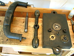
I managed to fully disassemble the press today and carry out a basic clean. Progress pictures here.

From the look of the base nuts in particular, I think that at some point in the past the press has actually been in much worse condition than it is today. In fact I realise now that the curved plates bolted to either side of the main arm were added to hold the arm together after it snapped in the middle (that must have been quite some overtightening!) I also wonder whether the main shaft might have been replaced at that time, as it is in very good condition.

Anecdotally that restoration must have been more than 16 years ago, but it seems to have done it in good stead as I had no trouble doing a complete stripdown and reassembly. The only concern was when the entire inside thread on the main arm disintegrated and fell out like an old gasket. There is a vestige of threading remaining, which I'm hoping is enough for light operation. In any case it seems to still work fine after I put it back together, and is now operating very smoothly.

A basic clean up revealed that the upper and lower caps around the main shaft are brass, as of course are the top nut and the handle knobs—they should all polish up nicely. The caps had been painted black but that came off easily, and the remaining paint on the main press is also starting to yield to my sophisticated removal techniques (screwdriver, big wire brush). Lots more scraping and scrubbing lies ahead.

Saturday, March 6, 2010

I see some work in my future

Not quite mint condition, but fully functional, and acquired for a very reasonable price.

See here for further views.

Sunday, February 28, 2010

Anyone for Typograminton?

Imagine settling into your seat at a world-class tennis match. The players come on to polite applause, go through their warm-up rituals, and prepare to begin the game. But today, before the ball is served, the first player dashes off a quick watercolour landscape on an easel by the side of the court. Their opponent keeps one eye on the incoming ball as it crosses the net, while quickly sketching some extra features onto the canvas with a stick of charcoal. Moments later, the spectator beside you expresses his mild disappointment that the quality of the return lob is only fair to middling, and you stare at him in open-jawed amazement. Can he really be so ignorant that he doesn't comprehend what is happening here??

So proceeded yesterday's pre-season Layer Tennis exhibition match. Not the first experiment in mixing up the usual format, this match featured two top-notch typographers facing off for ten exchanges, bringing their very specific specialist skills to the arena that usually features expert proponents in the general field of graphic design.

Peter Bruhn from Sweden faced the USA's Mark Simonson, in a match where each volley contributed to the real-time evolution of a brand-new typeface. New glyphs added at every turn, subtle variations in weight and form, furious tussles over serif style: this match had it all for the type aficionado. Stems were clipped, then notched, and bowls cut violently open. And despite keeping remarkably well to the challenging 15-minute-per-exchange timeframe, these masters of their craft still managed to frame their work in a wider graphic context, spicing their creations before each return with a smattering of photoshop artistry.

Ah, but there's the rub: inevitably, not only are these gentleman artists of a slightly different stripe to those typically featured here, but their meticulous labours on the type itself would have left precious little time at each exchange for the final graphic seasoning (a contractual requirement, perhaps, in order to make use of at least one of the series sponsor's products?) Obviously, it would be unreasonable to expect the graphic component of this match to approach that of some of the classic matches of yesteryear.

So while devotees of the fine art of typography expressed their awe in the backchannel commentary, some also seemed to take a little offence at the occasional "meh" from others who—arguably—didn't show due respect to the achievement that was playing out before their ignorant eyeballs.

Typography is, in fact, almost always a prominent feature of the best Layer Tennis matches. The use of type allows the inclusion of crowd-pleasing trash talk, as well as contributing the same vital elements of style and visual interest that it does in most graphic work in the wider world. And whilst the players that usually duke it out in this amphitheatre may not have the typo-genius skills of Bruhn and Simonson, neither are graphic specialists always the typo-ignoramuses that the occasional over-sensitive fontography fanboy might like to think.

The third human element in Layer Tennis is, of course, the running commentary, arguably as much of a challenge for the person in that hot seat as the one faced by the players themselves. Yesterday's match featured a prime example by their fellow man-about-type Grant Hutchinson, squeaking in an expert and apposite commentary on each volley—often just before the reply—and apparently collapsing in a sweaty heap at the conclusion of the match.

So what did we learn from this bold experiment? Could this be the chess boxing of the graphic arts world? Or something a little more high brow? Personally, I would class this as a qualified success, a potential specialised spin-off of Layer Tennis with a slightly narrower but no less enthusiastic audience. I think keeping the graphic aspect would be a wise move, but the volley time should be increased to at least 20, and probably 30 minutes. The world needs its typographers, and we don't want the top players dropping dead from mental exhaustion!